Design Forms Correctly, Essential UX for User Input
Introduction
Forms are the most common functional elements on websites and the bridge to user actions like purchasing, signing up, and filling out surveys all rely on them. However, such an important experience is often overlooked, so I decided to summarize the experiences a good form should provide and why they should be designed this way.
Designing Labels
Label is the text next to user input that describes the purpose of the input, similar to a title for each input
A common problem is omitting labels or fading them out purely for aesthetics, which makes it difficult for users to identify and read the purpose of the input fields.
The vast majority of input fields should have labels. Avoid hiding labels unless absolutely necessary; their purpose is to let users know what each input is for. If space or visual reasons require omission, consider using an icon instead. For example: search boxes often sit at the top of a site with limited space for a label — using a search icon as a substitute is acceptable.
- Avoid omitting labels whenever possible; if unavoidable, use an icon as a substitute
- Ensure labels are readable and communicate the input’s purpose
- Keep labels short (1–2 words) to describe the input field’s purpose
Designing Placeholders
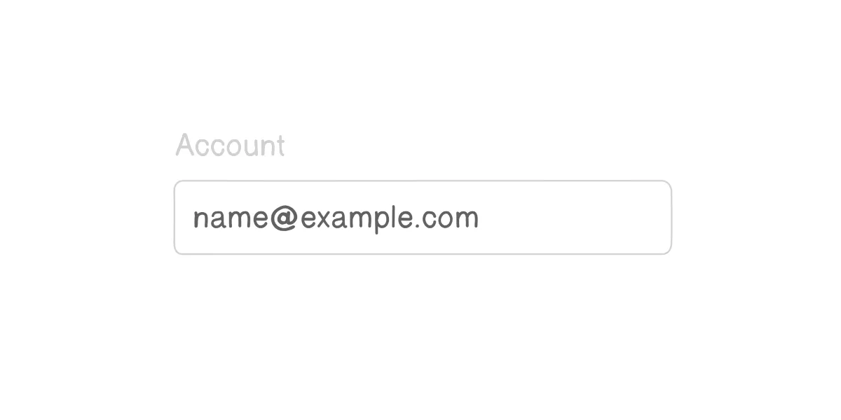
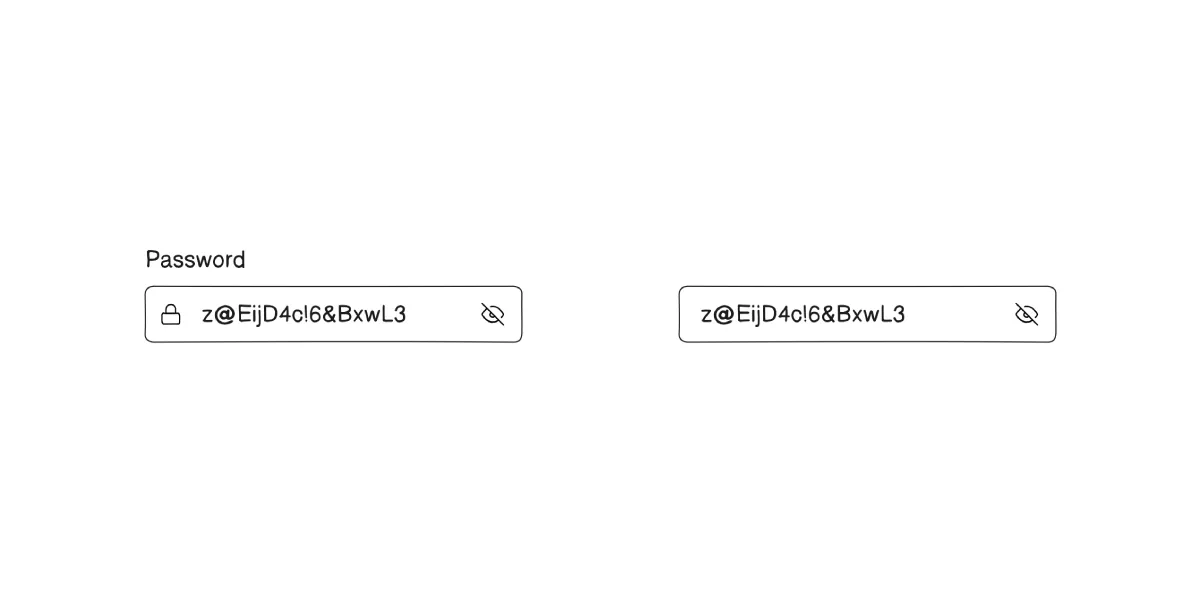
Placeholder is temporary dummy content used to describe what input data might look like. In forms, placeholders usually refer to the input field’s placeholder attribute — a short hint text typically used to describe the input format, example, or expected content
A common problem is using placeholders to describe the purpose of the input, which can cause users to forget the input’s purpose after the placeholder disappears when they start typing. Good placeholders should primarily describe example input formats; for instance, an email placeholder might be name@example.com to reduce users’ cognitive load.
- Use placeholders to describe input format, examples, or expected content; avoid using them primarily to describe the input’s purpose
- Make placeholders visually distinct from user input so users don’t mistake the placeholder for actual entered content
- Note that placeholders can cause many usability issues, such as: styles that are hard to distinguish, difficulty differentiating them from real input in high-contrast mode, and relying on users’ short-term memory. They can be an aid but should not be overly relied upon.
Form Submission Behavior
If a form lacks a clear call to action (CTA), users may not know how to submit it after filling it out. Do not rely solely on keyboard keys to submit forms; always let users know the next step after completing the form, such as a clearly labeled submit button or loading new data for users to choose from.
Further Reading
- UI Designer’s Guide to Creating Forms & Inputs - ui prep
- Text fields & Forms design — UI components series - UX Collective